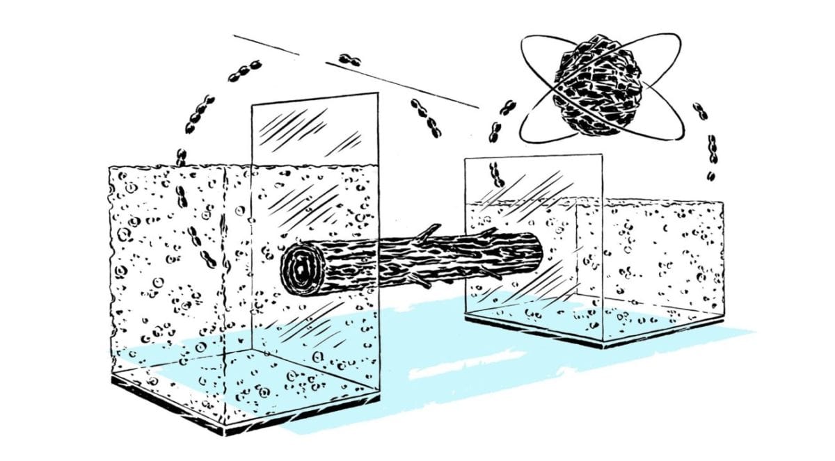
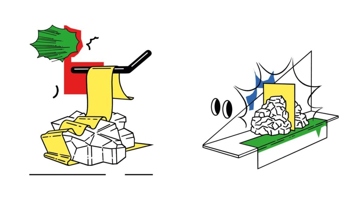
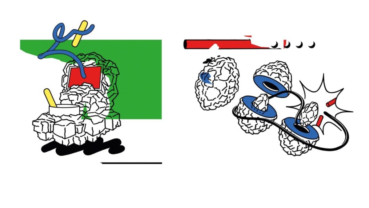
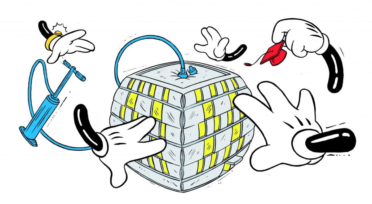
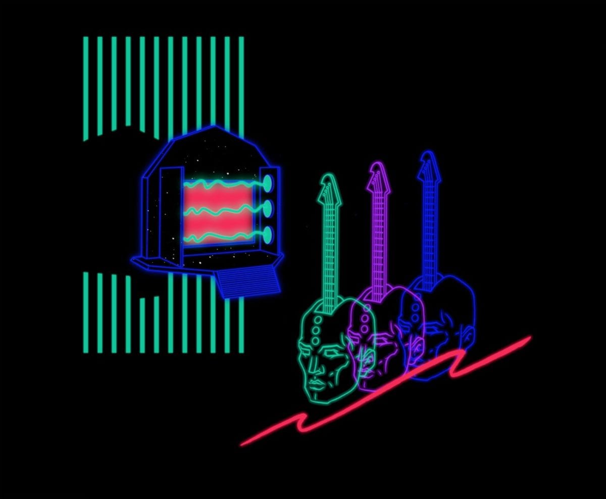
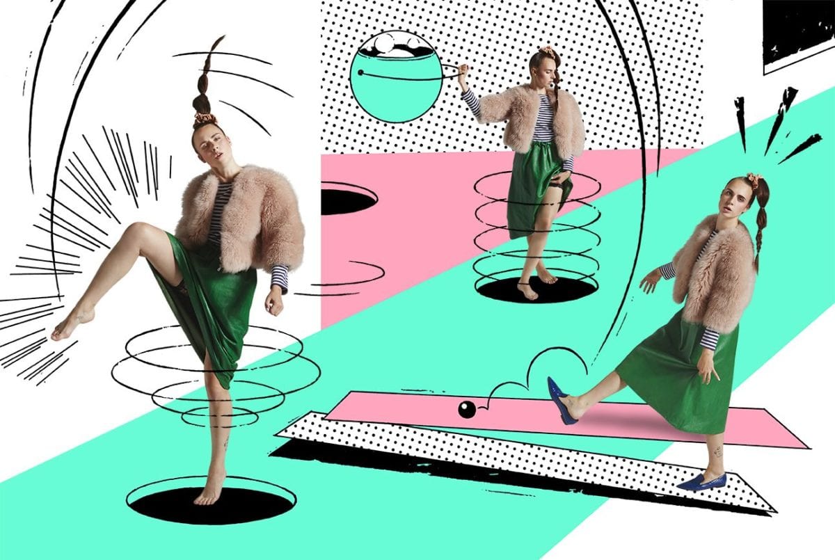
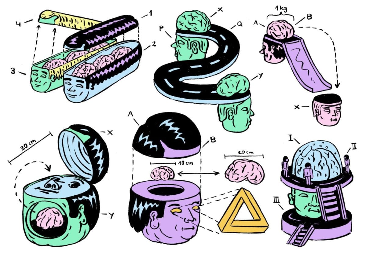
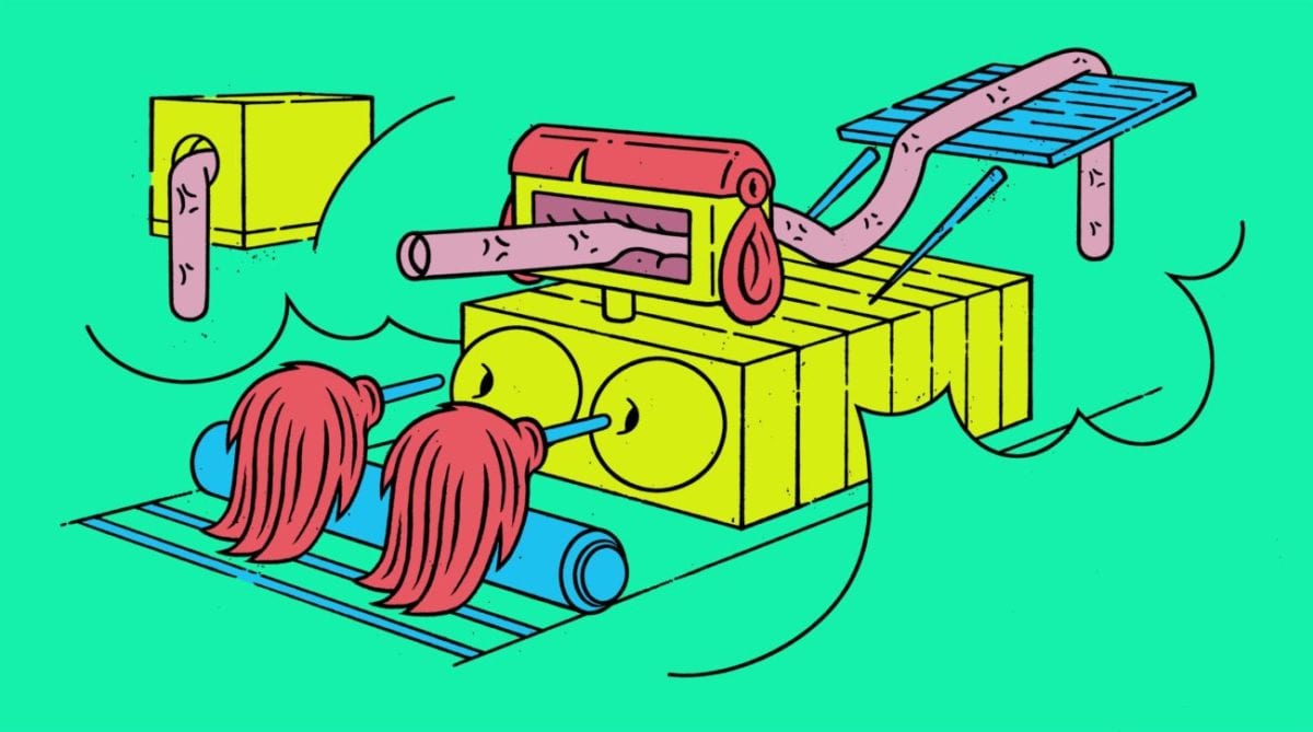
The name may not tell you much, but you’ve definitely seen Benedikt Rugar’s work floating around, either via his designs for Berlin’s Berghain and Watergate clubs, his cover art for Discodromo’s Cocktail d’Amore ‘Nothing Matters When We’re Dancing‘ compilation or various pieces for Red Bull Music Academy and many, many other widely-known brands and outlets.
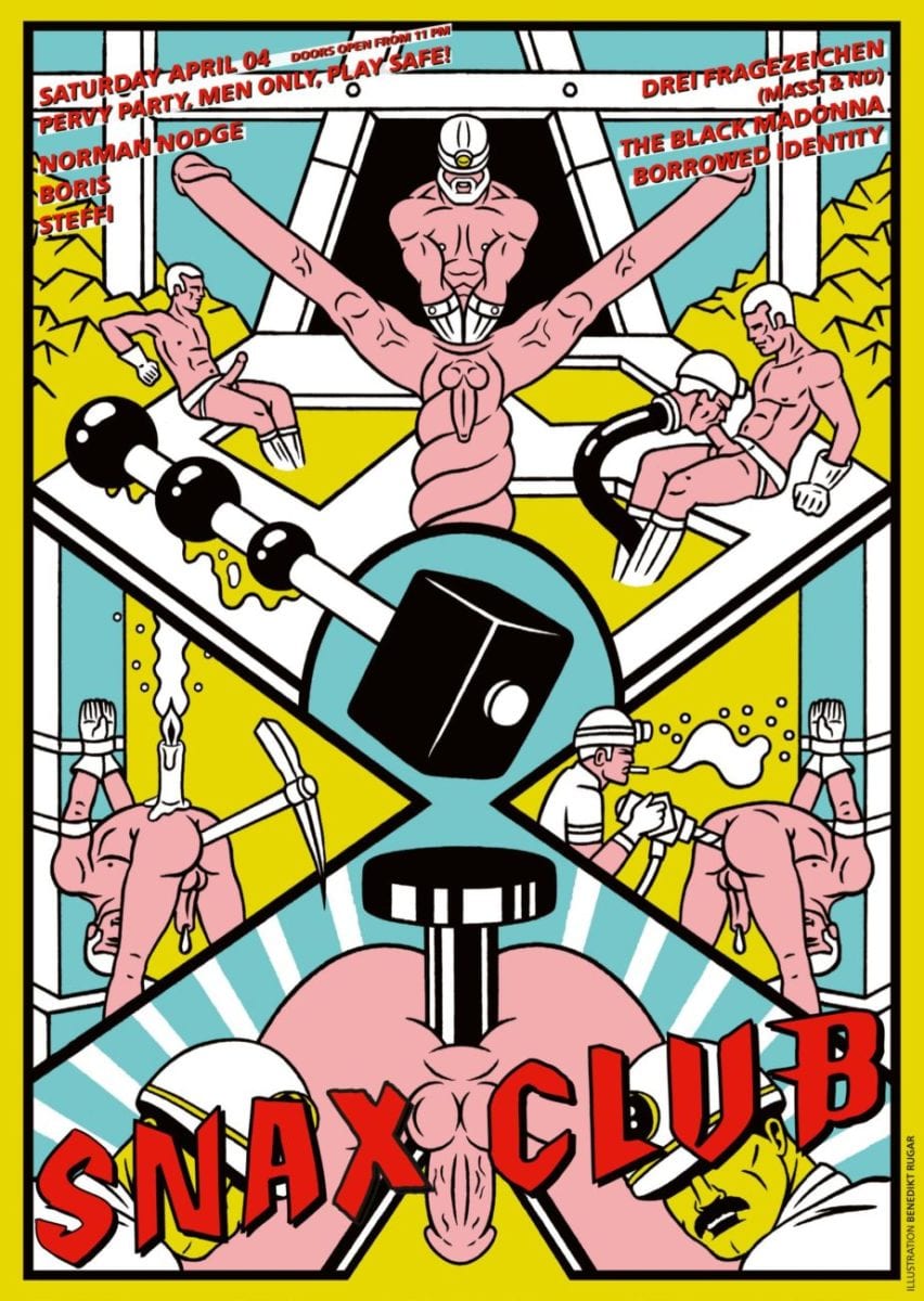
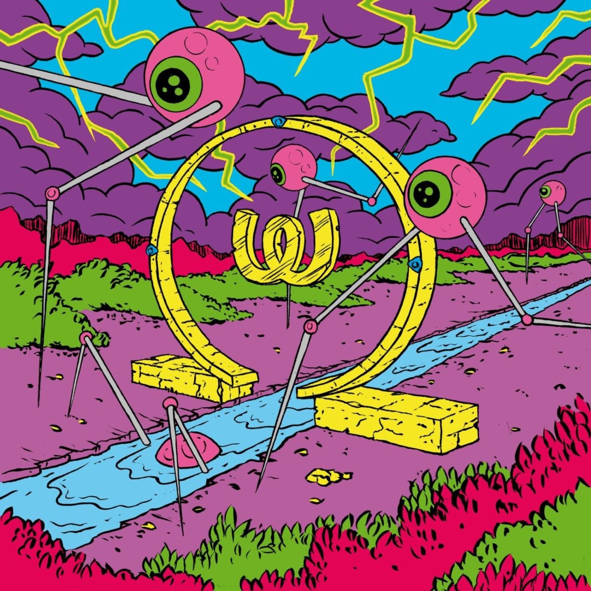
Brimming over with flexible, blobby shapes and sexually-explicit nods, his visuals share the same vivid palette made up of flat shades of generally hot-tempered colours, relying on a strong sense of composition and deftly-mastered technique of the ligne claire. Benedikt accepted to answer a few of our questions and sheds light on his subtle craft, favourite music and the stunning mosaic he conceived for Bangkok’s freshly-established Beam Club.
Interviewed by Baptiste Girou

"Lately I rediscovered one of my old school books and noticed
they were full of little sketches and perverted comics."
For how long have you been drawing? What’s been your first connection with graphic art?
As for the real awareness and enthusiasm for drawing, I only developed it later on in my studies. Though lately I rediscovered one of my old school books and noticed they were full of little sketches and perverted comics.
Tell us about your collaboration with Berghain. I guess it adds some extra pressure to visually represent what is certainly the most famous club in the world right now…
Yes, that can’t be denied. The monthly Berghain flyers draw a lot of international attention. Since it is world-famous it’s often enough for people to recognise that name in your references to make them feature you. Personally I enjoyed this project as this club is my favourite and I am often there myself.
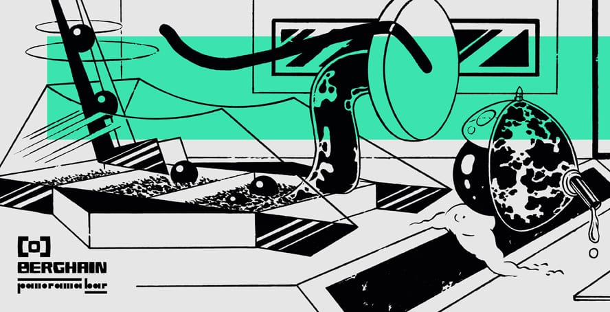
"With my design I wanted to translate this Berghain feeling
of plain industrial architecture, hard techno and dark mystic
atmosphere into a setting of playful objects that remind
you of sex toys and fetish masks."
Did you follow a special course for these flyers? Did Berghain weigh in on artistic choices?
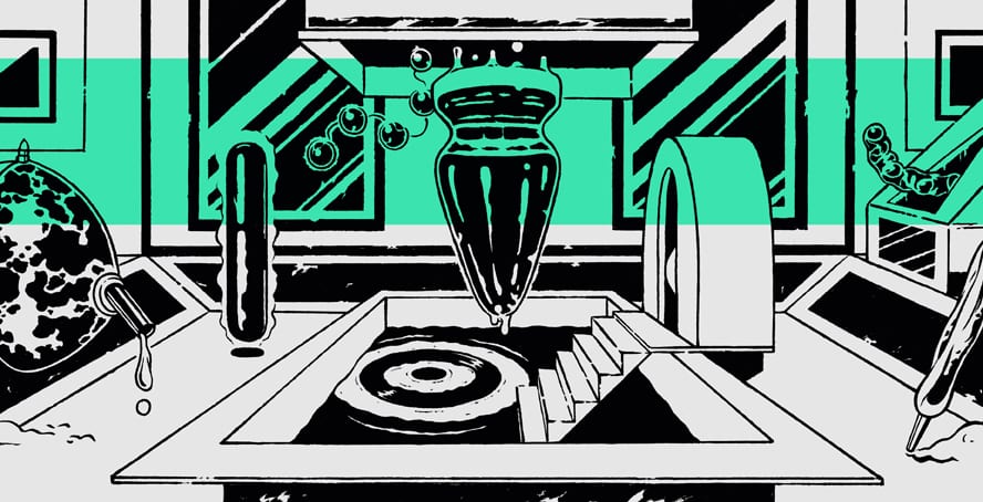
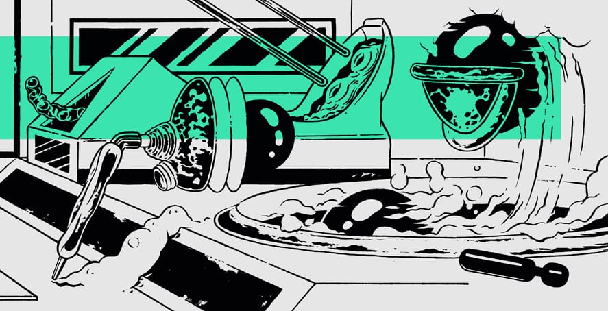
The artists invited each month are free to design whatever they want. With my design I wanted to translate this Berghain feeling of plain industrial architecture, hard techno and dark mystic atmosphere into a setting of playful objects that remind you of sex toys and fetish masks.
Your visual style is colourful and catchy, radically diverging from the dark aesthetic generally associated with the techno scene…
I feel it’s generally good for illustrators to know about visual cliché in order to create something new. Those flyers are stylistically often very different. For instance I would find it a cool access to implement a techno flyer executed as a potato printing.
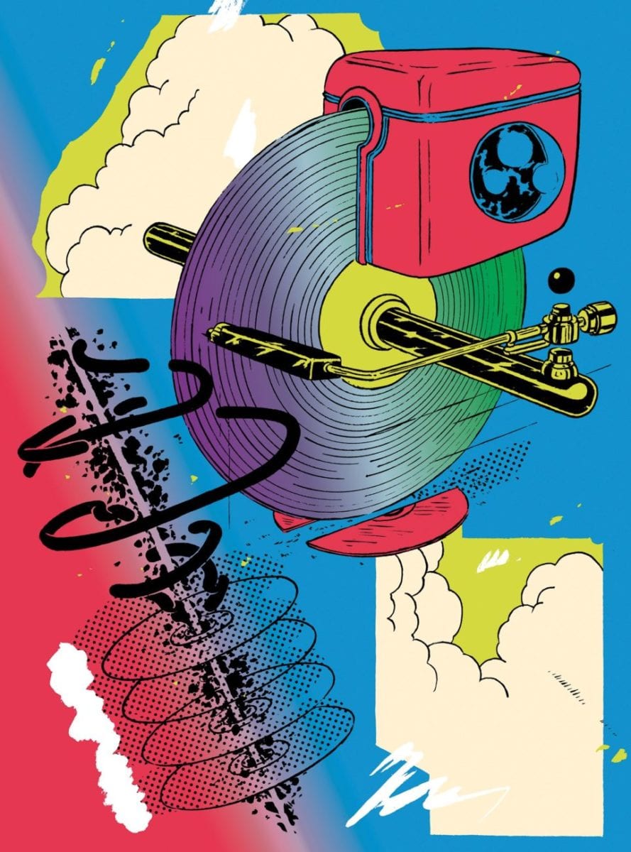
"I find inspiration in all sorts of other things which aren't
comic-related to be honest. This can be net finds, an Ikea
construction manual or a futuristic Rendering in old books."
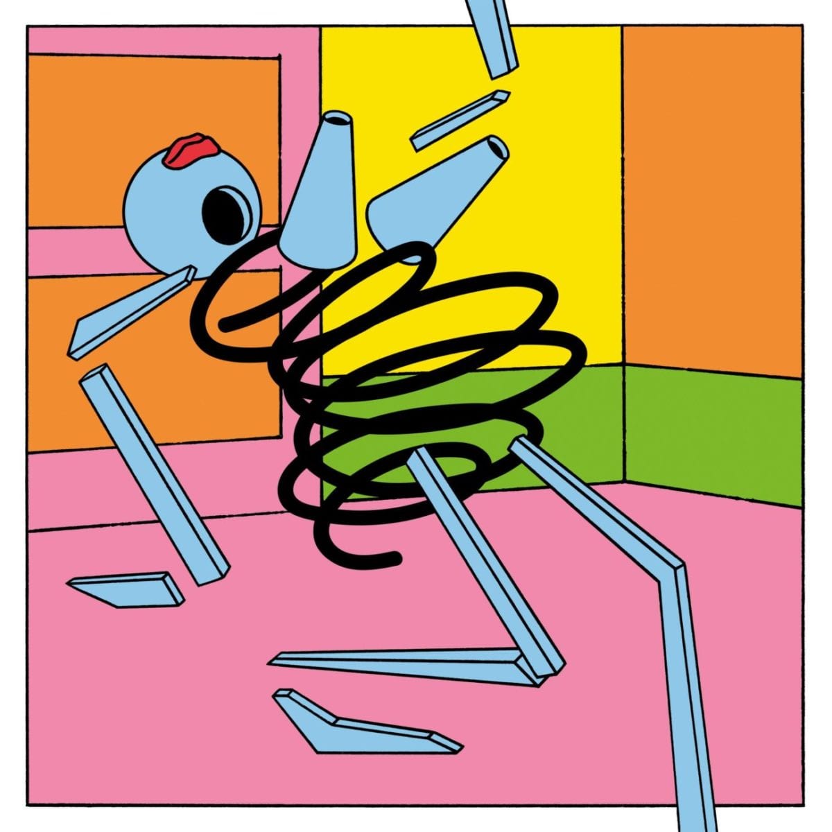
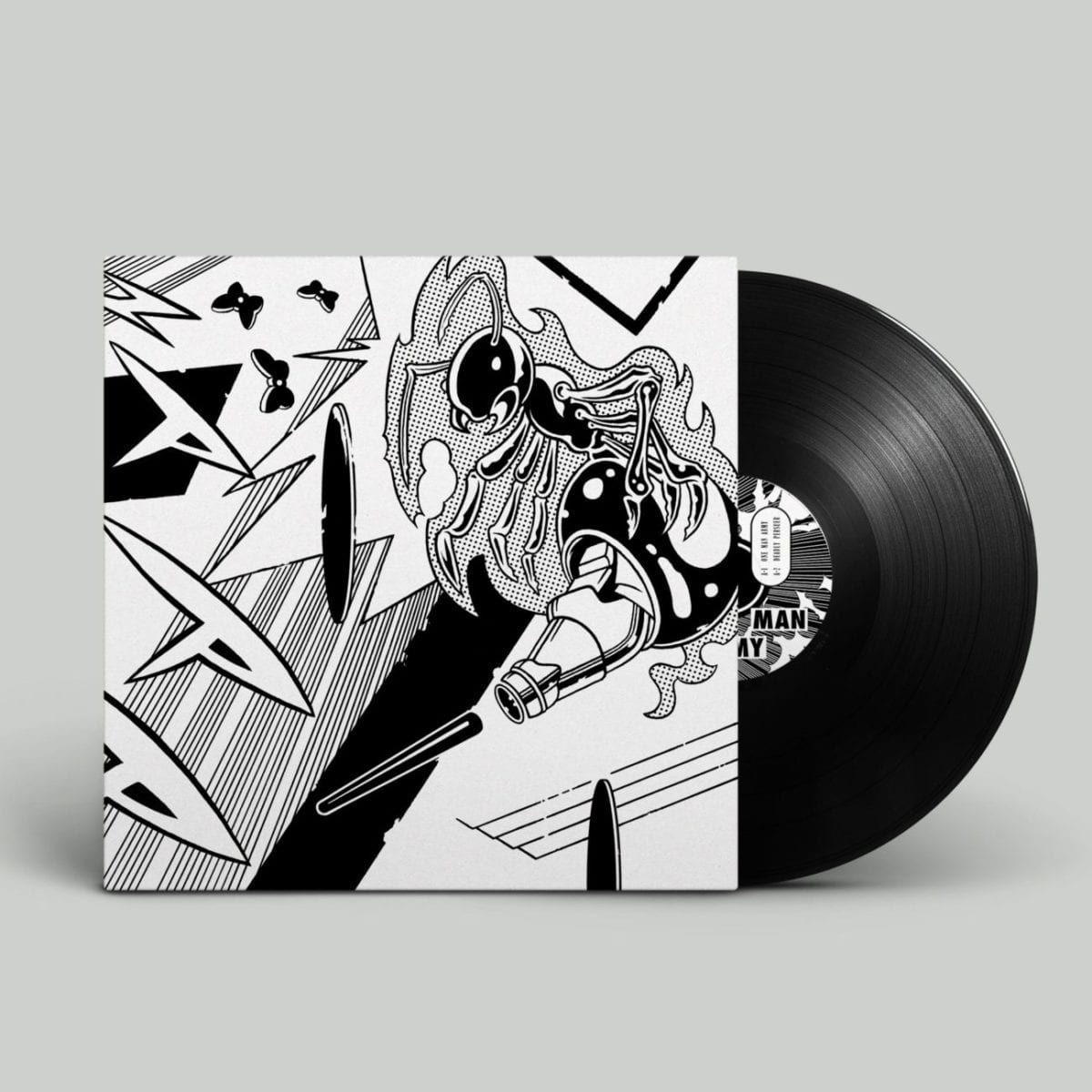
Your black and white illustrations recall to me of vignettes from Charles Burns comics. Is this kind of illustration a source of inspiration to you?
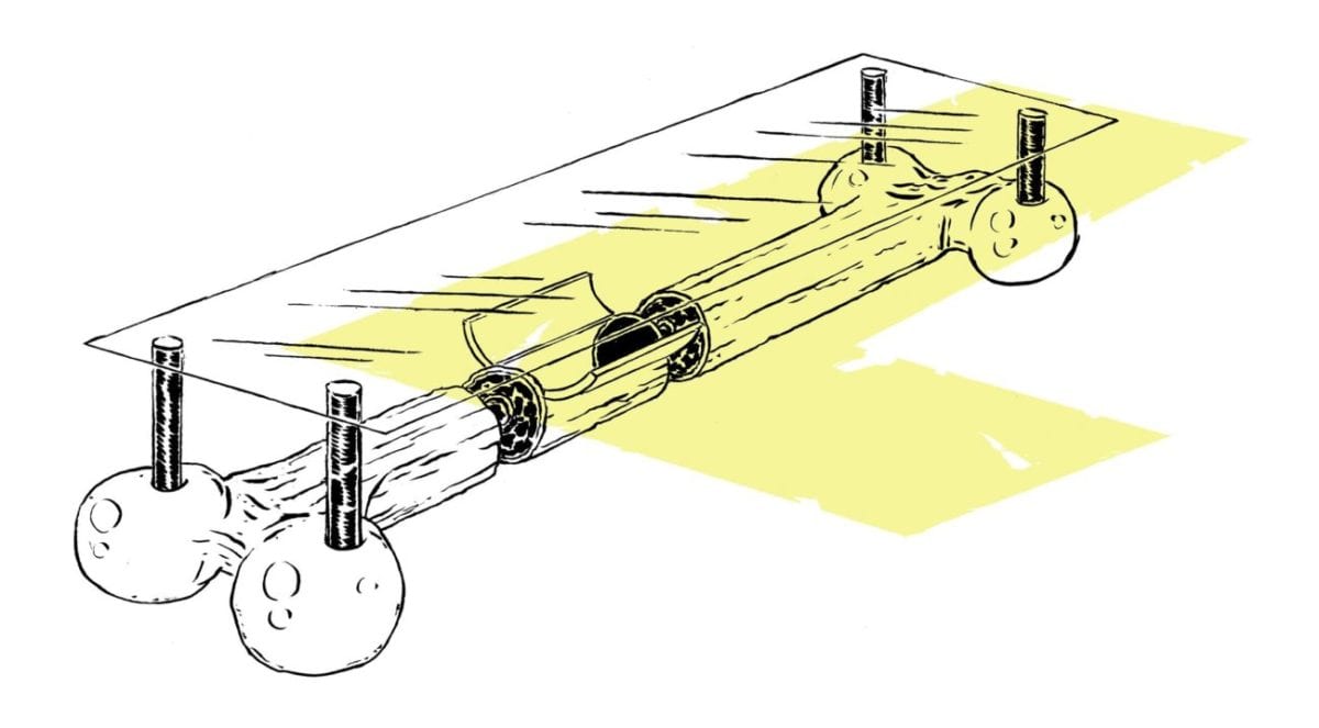
I find inspiration in all sorts of other things which aren’t comic-related to be honest. This can be net finds, an Ikea construction manual or a futuristic Rendering in old books.
Which artists are you looking up to?
Yuichi Yokoyama, who tells stories in images totally unconventionally, with a clean and clear language of crazy compositions and deep worlds. Also older artists like Fletcher Hanks and Glen Baxter continue to inspire me.
You’ve been working on a mosaic for Bangkok-based Beam Club, which is definitely not an everyday kind of project! Please tell us more about it.
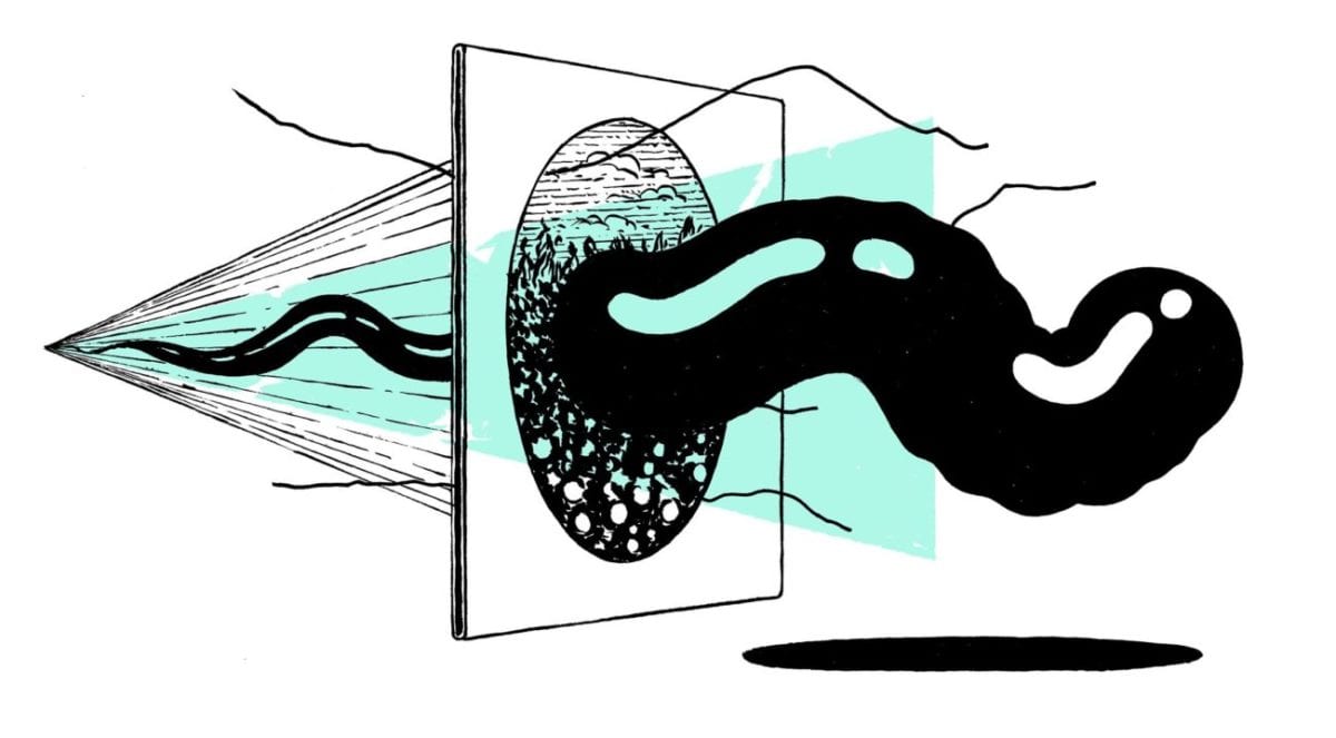
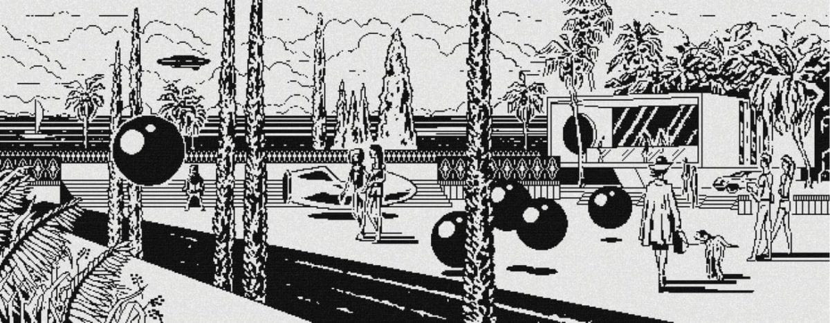
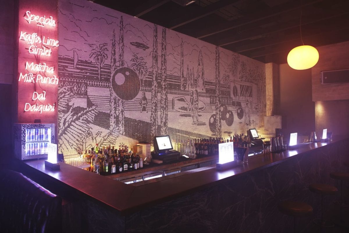
I’ve been asked to design a seven meter long wall behind a bar in a newly constructed bar in Bangkok. We then came up with the idea to not just put a conventional rendering on the wall but to solve this challenge by creating a huge mosaic. The intention was to create a window to a fictional landscape. The dimensions of the wall were a challenge of course as well as the integration of the interior.
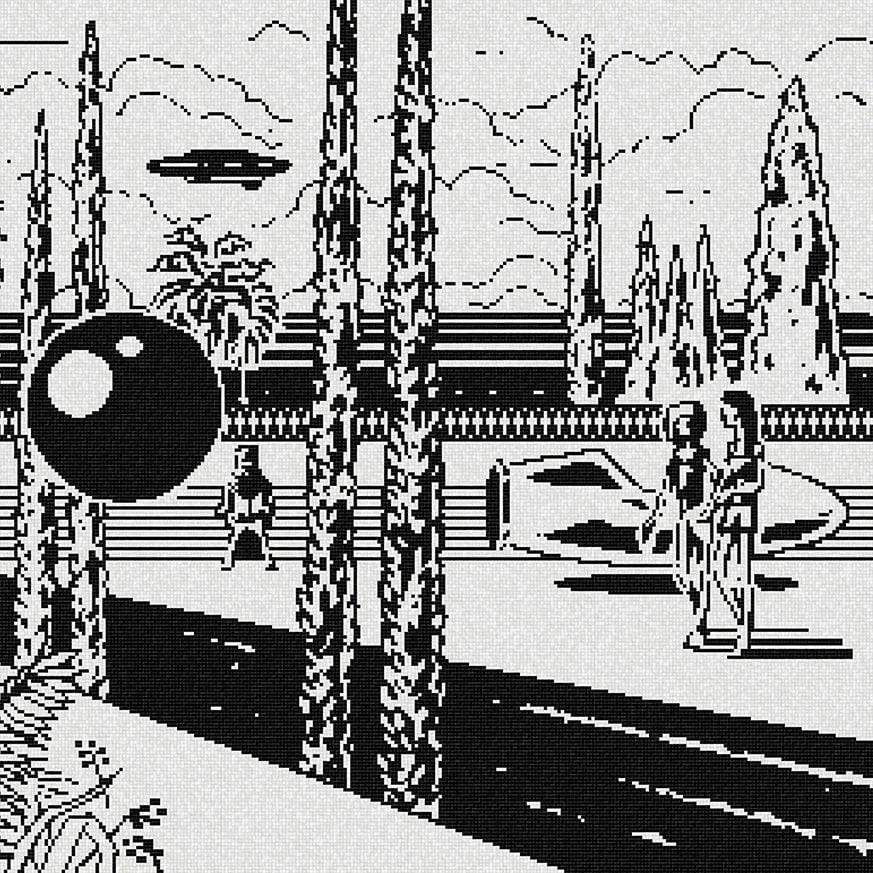
"Since the bar is located in some quieter area of the club the
scenery was supposed to have a more dreamful look-and-feel about it.
It should invite the guest to stay."
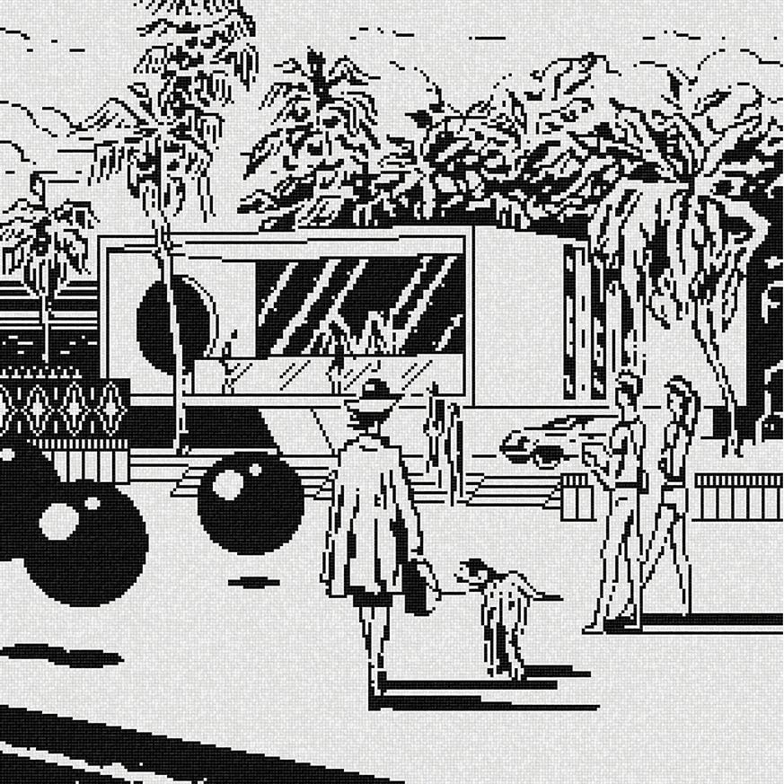
"I instantly had to think of futuristic images from the 1960s
where families gather in front of spacey buildings, representing an
unspectacular every day life scenery but in an imposing environment."
Since the bar is located in some quieter area of the club the scenery was supposed to have a more dreamful look-and-feel about it. It should invite the guest to stay. I instantly had to think of futuristic images from the 1960s where families gather in front of spacey buildings, representing an unspectacular every day life scenery but in an imposing environment.
As an illustrator for reputed techno events, I guess you’re listening to loads of electronic music. What’s spinning at the minute?
This is what is playing a lot on my headphones at the moment:
Toulouse Low Trax – Rushing Into Water
Cowboy Rhythm Box – Shake
And these producers from Buenos Aires, that I have just been introduced to:
Carisma – Dueños De Este Instante
Rumanians – Caballo
What’s lined up for you in a near future? Any collaborations you’d like to tell us about?
One project I am working on at the moment is the cooperation with the Italian techno label Raw Waxes for some EP cover design. Another project is the cooperation with graphic studio SerialCut from Madrid for which I am creating some artworks that they translate into a CG (3D image).
I like when this happens in a cooperation: when other media and domains interfere and something new is growing. This also broadens my own spectrum.
Photography by Emmanuele Contini
Discover more about Benedikt Rugar on Inverted Audio or Benedikt’s website.
